The task of compiling vacancy numbers is a bit on the arduous side, so I only do it once per quarter. Tracking database activity, on the other hand, is a bit easier, so I do it monthly to get an idea of how the quarterly numbers might pan out.
Admittedly, totals like these can be deceptive. If I take one 100,000 square foot availability out of my database and then add in three 5,000 square foot availabilities, the market is better off, even though my database activity is going to show a net of 2 added availabilities, but since I'm dealing with hundreds of records flipping each quarter, the data seems to pan out pretty well in terms of predicting performance.
 |
| Click on the graph to make larger |
The graph above tracks the percentage of availabilities removed (either as sales, sub-leases, leases or, in some cases, an availability simply being withdrawn from market) to the total number of availability updates that quarter. On average, I update over 9,000 availability records every quarter (which means that some availabilities are updated multiple times each quarter), so if the percentage of availability removals rises, it often correlates to stronger performance in the market.
You'll notice above that there was a spike of availability removals in the second quarter of 2011, which did in fact correspond to better net absorption numbers. The percentage of removals then dipped in the third and fourth quarters, and has risen significantly in the second quarter of 2012. This suggests that net absorption will be improved in Q2, 2012 (knock on wood). More importantly, the trend does suggest a slowly improving market. It also shows, over the past three years, a pattern of increased (positive) activity in the second quarter of each year, followed by a lull in the second half of the year.
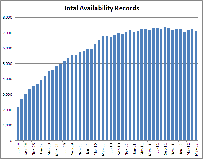 |
| Click on graph to enlarge |
The total number of availabilities tracked in the system declined in May after having risen in March and April. In the graph above, you can see the rapid rise in total availabilities from July 2008 to September 2010, then the slower rise from September 2010 to May 2011, and the very gradual downward slope (so gradual it almost looks flat) beginning in May 2011 and running to the present figures.
 |
| Click on graph to make larger |
Breaking the "new availabilities added" down by product type, you can see - well, actually, you can see quite a mess. Month to month, availability additions can vary quite a bit, but the general trend has been downward, with office and industrial showing the steepest slope. Again, this is the total number of availabilities added, not the total amount of available square footage added.
You'll also note that the number of availabilities added increased for every property type in May 2012; fortunately, the number of availabilities removed was even stronger.
The overall trend seems to be favoring Southern Nevada - with fewer new availabilities over time, and fairly steady, though not rising, removals of availabilities over time. This actually sums up the market pretty well, with recovery being more a situation of "less bad" than "more good". As the wreckage of the Great Recession is gradually cleared, slow (perhaps very slow) and steady will win the race, even if it isn't very sexy.
No comments:
Post a Comment